

Pick one main color, one accent, and one neutral — then repeat a color across every element and keep the formality consistent throughout. That three-part formula covers almost every table setting you’ll ever style, from a casual birthday lunch to a holiday dinner.
Quick checklist before you set a single plate:
- Repeat at least one color across plates, napkins, and glassware
- Anchor the look with a neutral (cream, white, or natural)
- Keep formality consistent across all pieces
- Match the scale of your patterns (small with large, never small with small)
Pro Tip: Start with napkins and glassware before you touch the dinner plates. Accessories are cheaper, easier to swap, and will tell you fast whether a color combo works.
Key Takeaways
Matching tableware colors comes down to three decisions: pick a main color, add one accent, and anchor everything with a neutral — then repeat a color and keep formality consistent.
| Point | Details |
|---|---|
| Use the three-part formula | One main color, one accent, one neutral covers every table setting from casual to formal. |
| Match undertones, not exact shades | Warm-to-warm and cool-to-cool pairings read as intentional even when hues differ significantly. |
| Start with accessories | Test palettes with napkins and glassware before buying dinnerware — lower cost, easier to swap. |
| Keep formality consistent | Mixing a gold-rimmed charger with casual paper plates works only when the paper plate is the accent, not the main piece. |
| Usnovelty for low-cost testing | Themed dessert plates and beverage napkins from Usnovelty let you test any palette before committing to larger purchases. |
Table of Contents
- How to match tableware colors by building the right palette
- Which color-mixing strategy should you use?
- How to mix patterns without making the table feel chaotic
- Do shapes and formality levels actually matter?
- How do you coordinate flatware, glassware, and linens?
- Seasonal palettes and occasion-based color combinations
- A beginner’s step-by-step plan you can try tonight
- What to buy: disposable vs. reusable, finishes, and materials
- Why the “perfect match” mindset is the wrong goal
- Usnovelty makes palette testing easy and affordable
- Sources
How to match tableware colors by building the right palette
The simplest palette formula that works every time: one main color, one accent color, one neutral. Your main color dominates (dinner plates, charger, or tablecloth). Your accent appears in smaller doses (dessert plates, napkins, or glassware). Your neutral holds everything together without competing.
Here’s where most people go wrong: they try to match exact shades and end up with a table that looks like a failed attempt at uniformity. Designers advise focusing on shared undertones — warm or cool — rather than identical hues. A warm ivory plate pairs naturally with a warm terracotta napkin even if the shades are completely different, because they share the same underlying warmth. A cool-toned slate blue plate clashes with a warm mustard napkin for exactly the opposite reason.
A practical example: navy dinner plates (main) + blush dessert plates (accent) + cream napkins (neutral). The navy and blush share a cool undertone; the cream reads as warm but soft enough to bridge both. At Usnovelty, you can map these roles directly to product types: dinner plates or chargers carry the main color, themed dessert plates bring the accent, and beverage napkins fill the neutral slot.
Shopping rule: buy one neutral base set first, then experiment with accent plates or napkins before spending more. Swapping a $6 pack of napkins costs nothing compared to replacing a full plate set.
Which color-mixing strategy should you use?
Start with a basic palette and a plain neutral; beginners do best with monochrome or analogous strategies. Confident stylists can push into complementary or color-blocking territory.
Here’s a quick breakdown of each approach:
- Monochrome: one hue in multiple shades and tints (navy plate + sky-blue napkin + pale blue glass). Calm, elegant, hard to get wrong. Best for formal dinners or minimalist aesthetics.
- Analogous: two or three colors sitting next to each other on the color wheel (coral + peach + warm yellow). Feels warm and cohesive. Works beautifully for spring and summer parties.
- Complementary: opposite colors on the wheel (teal + terracotta, purple + gold). High contrast, visually exciting. Best for festive or holiday tables where you want drama.
- Tetradic: four colors arranged in two complementary pairs (red + green + blue + orange). Complex and bold — use it only when one color clearly dominates and the others appear in small accents.
- Color-blocking: large sections of solid, contrasting colors with no gradation (a red plate on a white tablecloth next to a black napkin). Modern and graphic. Works for contemporary or themed events.
| Strategy | Best for | Common mistake |
|---|---|---|
| Monochrome | Formal dinners, minimalist tables | Using shades too close together — the table reads flat |
| Analogous | Spring/summer parties, casual brunches | Pulling in a color too far from the group — breaks the warmth |
| Complementary | Holidays, festive celebrations | Equal amounts of both colors — one must dominate |
| Tetradic | Bold themed events | Too many colors at equal weight — pick one anchor |
| Color-blocking | Modern parties, graphic themes | Mixing too many blocks — stick to two or three solids |
For most home entertainers, analogous is the sweet spot. It’s forgiving, it photographs well, and it works across seasons just by shifting the specific hues.
How to mix patterns without making the table feel chaotic
The core rule: vary the scale of your patterns, repeat one color from each pattern across other elements, and anchor the whole thing with at least one solid piece. Start with one standout patterned piece as your anchor and build everything else around it.
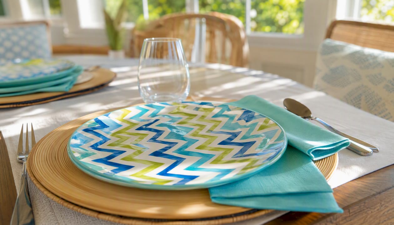
Scale is the part people skip. A small floral motif on a dessert plate, a medium stripe on a napkin, and a large geometric on a charger can all coexist because the eye reads them as different visual layers. Put two small-scale patterns next to each other and they compete. Put two large-scale patterns together and the table looks like a craft store exploded.
Pattern-mixing rules that hold:
- One hero pattern (your anchor piece, usually the most detailed or colorful)
- One supporting pattern at a different scale (stripes work almost universally as the supporting role)
- One solid to give the eye a place to rest
- Repeat at least one color from the hero pattern in the supporting pattern or solid
Pro Tip: Mix textures the same way you mix patterns. A matte-glazed ceramic plate next to glossy glassware creates visual interest without color conflict. If you’re using paper napkins, a slightly embossed or textured paper reads more intentional than flat.
For a practical setup: use Sparkling Candles Dinner Plates as your hero piece, pair them with solid-color luncheon napkins that pick up one color from the plate’s design, and keep the charger or placemat plain. The pattern does the work; everything else frames it.
Do shapes and formality levels actually matter?
Yes, and matching the overall level of formality is the glue that keeps mixed settings from feeling jarring. A gold-rimmed charger next to a flimsy paper plate reads as an accident, not a style choice. A ceramic dinner plate next to a themed paper dessert plate reads as intentional — because both sit in the same casual-to-semi-formal range.
Two quick examples:
- Casual party: paper plates in a solid color + colored plastic cups + printed paper napkins. Everything is disposable, everything is relaxed. The formality matches.
- Semi-formal celebration: ceramic dinner plates + themed disposable dessert plates + cloth-feel napkins. The dinner plate carries the formality; the dessert plate adds personality without undercutting it.
Shape repetition matters too. Round plates with round bowls and curved glasses feel cohesive. Mixing round plates with square appetizer plates works when you do it deliberately, but mixing three different shapes at random looks unplanned. Rim details follow the same logic: a gold-rimmed charger pairs well with a gold-accented napkin ring, but clashes with a silver-rimmed salad plate.
Dos and don’ts:
- Do pair gold-rimmed chargers with warm-toned paper plates in blush, ivory, or terracotta
- Don’t pair gold-rimmed chargers with cool-toned blue or silver paper plates — the metal tones fight
- Do mix ceramic and disposable when the disposable piece is the accent (dessert plate, side plate)
- Don’t make the disposable piece the main plate when the rest of the table is formal
How do you coordinate flatware, glassware, and linens?
Choose one metal tone and repeat it. That single decision ties flatware, candle holders, charger rims, and any metallic napkin rings into a unified frame without requiring you to match anything else.
Metal tone guide:
- Gold/warm: pairs with warm palettes (terracotta, blush, ivory, olive). Feels festive and rich. Use for fall dinners, holiday tables, birthday celebrations.
- Silver/cool: pairs with cool palettes (navy, slate, lavender, white). Feels crisp and modern. Use for winter tables, formal dinners, blue-and-white themes.
- Champagne/warm subtle: the most versatile option. Works with both warm and cool palettes when you need a metallic that doesn’t dominate. Good for mixed-palette tables.
For glassware, clear glass is the safest choice because it reflects whatever color sits beneath it. A clear glass on a blush tablecloth picks up the pink; on a navy cloth, it reads deeper. Colored glassware is a stronger commitment — a cobalt blue glass on a white table becomes a statement piece, which is exactly right when blue is your accent color and wrong when it isn’t.
Beverage napkins are the lowest-cost way to test a palette before buying glassware or flatware. Lay three napkin options next to your plates and step back. The one that makes the plates look more intentional is your answer.
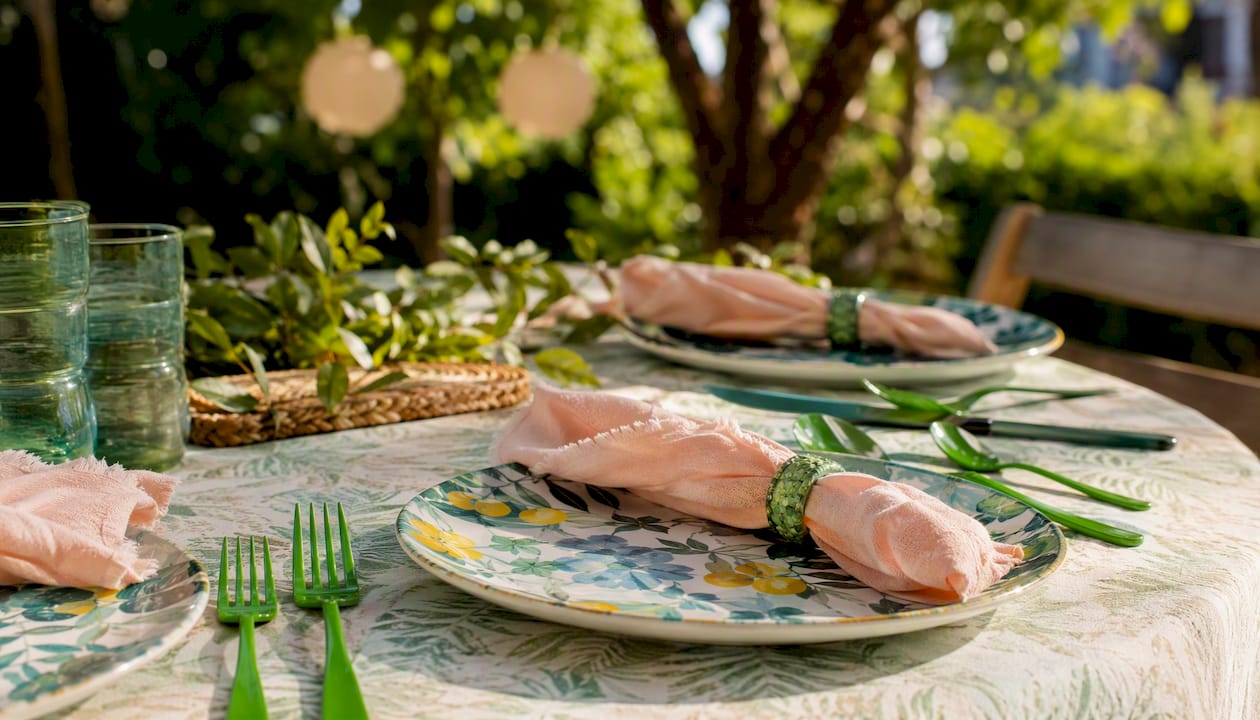
For colored flatware options that tie palettes together, festive green cutlery shows how a single color choice in the utensil can anchor a whole seasonal palette.
Seasonal palettes and occasion-based color combinations
Tableware trends for 2026/27 favor richer jewel tones and unexpected pairings — powder blue with chocolate brown, garnet with blush — so treat these palettes as a starting point, not a rulebook.
| Season / Occasion | Main Color | Accent | Neutral | Swap for variety |
|---|---|---|---|---|
| Spring | Sage green | Blush pink | Warm white | Swap napkins to lavender for Easter |
| Summer | Coral | Bright yellow | Natural linen | Swap dessert plates to turquoise for a tropical feel |
| Fall | Burnt orange | Deep burgundy | Cream | Swap charger to gold-rimmed for Thanksgiving |
| Winter | Navy | Icy silver | White | Swap napkins to forest green for Christmas |
| Holiday / Festive | Garnet red | Champagne gold | Ivory | Add jewel-tone dessert plates for drama |
| Birthday / Casual | Bright teal | Hot pink | White | Swap glassware to match the birthday theme |
For spring and summer, colored napkins and dessert plates from Usnovelty are the easiest swap. For fall and winter, themed dinner plates and gold-accented pieces carry the seasonal weight. For birthday tables, check out birthday tableware ideas to find themed combinations that already do the color work for you.
A beginner’s step-by-step plan you can try tonight
Experts recommend beginning with accessories — napkins, glassware, and linens — because they let you test palettes affordably before committing to dinnerware. Here’s a four-step plan that works even if you’ve never styled a table before:
- Anchor with your main plate. Put your dinner plate on the table. This is your fixed point. Everything else responds to it.
- Test with accessories first. Lay two or three napkin options next to the plate. Add a glass. Step back and look. You’ll know within 30 seconds which combination works.
- Swap one accent piece at a time. Add a dessert plate or a charger. Don’t change everything at once — one swap at a time tells you exactly what’s working.
- Photograph and adjust. Take a photo with your phone. Colors read differently in photos than in person, and a photo reveals imbalances your eye misses when you’re standing over the table.
Pro Tip: Buy a small pack of Party On Celebration Beverage Napkins in two different colors and use them as your palette test. At that price, you can try three combinations before committing to anything larger.
Build your collection iteratively. A full matching set is not the goal — a cohesive, interesting table is. Buy accent napkins and dessert plates in small quantities, test them, and expand what works.
What to buy: disposable vs. reusable, finishes, and materials
For single-use parties: disposable paper or plastic. For everyday use or keepsake occasions: ceramic or porcelain. That’s the short version.
| Material | Best for | Finish notes | Party cleanup |
|---|---|---|---|
| Paper | Single-use parties, casual events | Matte; absorbs color well; reads casual | Toss after use |
| Melamine | Outdoor parties, kids’ events | Glossy or matte; durable; color-stable | Dishwasher safe |
| Ceramic | Semi-formal dinners, keepsake events | Matte or glossy; color-rich; heavy | Hand wash or dishwasher |
| Porcelain | Formal dinners | Glossy; bright white base; shows color accurately | Hand wash recommended |
| Glass | Glassware, serving pieces | Clear or colored; reflects light; elevates formality | Dishwasher safe (most) |
Finish affects how colors read under light. Matte finishes absorb light and make colors look deeper and more saturated. Glossy finishes reflect light and make colors appear brighter and lighter. Under warm party lighting, a matte terracotta plate looks rich and earthy; under cool overhead light, it can look flat. If your party space uses warm Edison-style bulbs, lean toward matte finishes. Cooler LED lighting makes glossy pieces pop.
Buyer checklist for online ordering:
- Confirm the plate diameter (standard dinner plate is 10–11 inches; dessert plate is 7–8 inches)
- Check whether pieces nest for storage or shipping
- Read the rim detail description — a gold rim that photographs warm may look brassy in person
- Review the return or exchange policy before ordering a large quantity
When mixing high- and low-cost items, let the plates carry the personality and keep napkins, placemats, and glasses more uniform. That framing approach lets eclectic plates take center stage without the whole table looking random. For a full party tableware comparison that covers material and style options, Usnovelty’s buying guides walk through the tradeoffs in detail.
Pro Tip: Start with low-cost accent pieces — a pack of themed dessert plates or beverage napkins — before investing in ceramic dinnerware. If the color combination works at the paper level, it’ll work at every level.
Why the “perfect match” mindset is the wrong goal
Most people approach tableware color the same way they approach paint swatches: they want everything to match perfectly, and they get frustrated when it doesn’t. That’s the wrong frame entirely.
The tables that actually look good — the ones you photograph and remember — are built on contrast and intention, not uniformity. A single patterned plate surrounded by solids looks curated. A table where every piece matches exactly looks like a catalog photo: technically correct, completely forgettable.
The undertone rule from earlier is the real unlock here. Once you stop chasing exact hue matches and start asking “are these all warm or all cool?”, the pressure disappears. A vintage plate from a thrift store can sit next to a brand-new paper dessert plate and look intentional, as long as they share an undertone and a formality level.
The other thing most guides won’t tell you: lighting changes everything. A palette that looks balanced in afternoon daylight can look completely different under warm candlelight or cool overhead LEDs. Test your combinations under the actual lighting you’ll use for the event, not just in a bright kitchen at noon.
Usnovelty makes palette testing easy and affordable
Napkins and dessert plates are the lowest-risk way to test any color combination before you commit to larger purchases. Usnovelty carries a curated range of colored beverage napkins, themed dessert plates, and celebration luncheon napkins that let you run a full palette test for a few dollars.
Three ways to start experimenting right now:
- Party On Celebration Beverage Napkins: pick two contrasting colors and lay them next to your dinner plates. This is your fastest palette test.
- Perfect Time to Party Dessert Plates: add a patterned accent plate without replacing your main dinnerware. Eighteen plates per pack means enough for a full party table.
- Celebration Balloons Luncheon Napkins: a festive print that ties into balloon-themed décor and works as both a palette anchor and a party accent.
Usnovelty has been supplying celebrations since 1922, and orders over $75 ship free. Browse the full party supplies collection at Usnovelty to find the napkins, plates, and themed bundles that fit your next table setting.
Sources
The following sources informed the advice throughout this article:
- How To Mix And Match Dinnerware Like A Seasoned Southern Host
- The Food52 Guide to Mixing & Matching Your Tablescape
- How to mix and match plateware
- How To Mix and Match Plates Without Overthinking It