

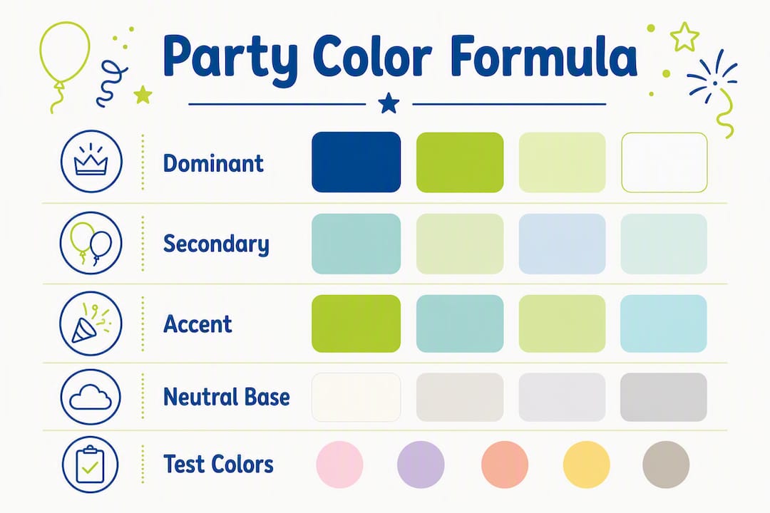
Pick a dominant color, a secondary color, and one accent. Keep the total to a small, manageable palette, add a neutral base, and optionally finish with a metallic. That formula handles most events, from a backyard birthday to a formal cocktail party.
Here is a quick checklist to get started:
- Choose your dominant color first and buy your largest items in it (tablecloths, backdrops, foil banners)
- Add a secondary color for mid-size items: plates, napkins, and balloon clusters
- Pick one accent for small pops: confetti, toppers, or metallic napkins
- Screenshot your palette and test it under venue lighting before you finalize any order
TL;DR: Select a dominant, secondary, and accent color using the 60-30-10 rule. Buy large items first, test under real lighting, and limit your palette to 2–4 colors to keep everything cohesive.
Table of Contents
- Why does color choice actually affect your party?
- What are the practical rules for a cohesive party palette?
- How do you go from a blank page to a shopping-ready palette?
- What color palettes work best for specific events?
- How does lighting change your colors, and how do you test it?
- What color mistakes do most party hosts make?
- A pre-buy checklist for validating your palette
- What does color mean across different cultures?
- Key Takeaways
- The part most guides skip
- Ready to shop your palette at Usnovelty?
- Useful sources
Why does color choice actually affect your party?
Color does more than look pretty. It shapes how guests feel the moment they walk in, how long they linger in certain spots, and how your photos turn out afterward.
Warm tones drive energy and optimism, cool tones encourage calm and trust, and deep or dark tones signal elegance and formality. A kids’ birthday in coral and yellow feels electric. The same room in navy and charcoal reads like a corporate dinner. Neither is wrong; they just serve completely different goals.
Beyond mood, color does functional work. Event designers deliberately use warm zones for socializing and cool zones for focused activities, guiding guests without a single sign. Put warm-toned balloon clusters and bright tableware near the bar or dance floor. Use cooler, muted tones at the gift table or dessert station where guests pause and focus. The décor does the directing.
Pro Tip: Place your brightest, warmest accent color at the focal point you want guests to notice first, whether that is the cake table, the photo backdrop, or the entrance arch. It works the same way a spotlight does.
Seasonality and guest culture matter too. Color associations shift dramatically across cultures; what reads as celebratory in one context can signal mourning in another. Before you commit to a palette, consider who is on the guest list and what the occasion means to them. A palette that feels festive to you may land differently for guests from a different background.
What are the practical rules for a cohesive party palette?
Three rules cover most situations. Learn them once and you will never stare blankly at a party supply aisle again.
The 60-30-10 rule
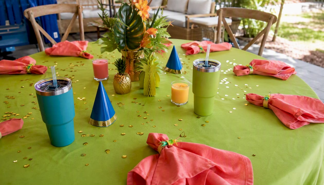
The 60-30-10 rule splits your palette into dominant, secondary, and accent roles. Translated to products: your tablecloths, backdrops, and large balloon arrangements carry the dominant color. Plates, napkins, and mid-size balloons carry the secondary. Confetti, cake toppers, metallic napkins, and small favor items handle the accent.
The 2–4 color limit
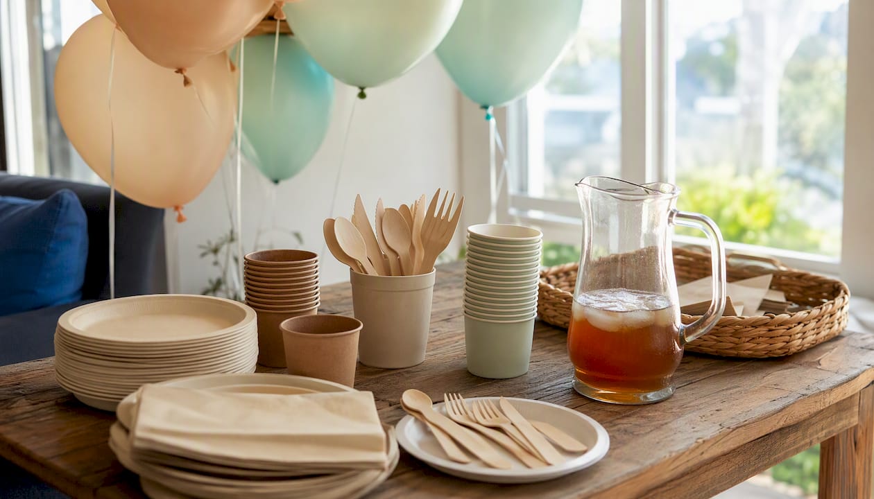
Keeping your palette to 2–4 colors, including a neutral base, prevents visual clutter. A neutral (white, ivory, kraft, or black) gives the eye a place to rest between saturated items. A metallic accent, gold, silver, or rose gold, bridges colors that might otherwise clash and adds a layer of polish without counting as a full fourth color.
The 3-color décor rule
Borrow this from fashion: no more than three colors visible in any single vignette (a table setting, a balloon cluster, a dessert station). More than three in one spot creates noise. Fewer than two can look flat.
| Rule | What it controls | First product action |
|---|---|---|
| 60-30-10 | Color distribution across the room | Buy tablecloths and backdrops in dominant color |
| 2–4 color limit | Total palette size | Choose neutral base before adding saturated colors |
| 3-color vignette | Cohesion at table/station level | Limit each table to dominant + secondary + one accent |
| Metallic bridge | Transitions between colors | Add metallic napkins or a metallic banner last |
Pro Tip: When in doubt, buy your neutral and metallic items first. They work with almost any palette and give you flexibility if you change your mind on the saturated colors.
Visual shopping formula: Tablecloths and backdrop = dominant color (60%). Balloon kits, plates, and luncheon napkins = secondary color (30%). Cake topper, confetti, and metallic accents = accent (10%).
How do you go from a blank page to a shopping-ready palette?
Five steps, in order. Skip one and you will likely end up with supplies that almost match.
-
Decide the event mood. Write one word: energetic, elegant, playful, romantic, festive. That word maps to a color family. Energetic points to warm saturated tones. Elegant points to deep jewel tones or monochromatic neutrals. Playful opens the door to bright primaries or pastels.
-
Pull anchor colors from a focal image. Use a photo of the venue, the cake design, the floral arrangement, or any hero image to extract 1–2 anchor colors. Those anchors become your dominant and secondary. Everything else builds around them.
-
Apply the 60-30-10 rule. Assign your anchor colors to dominant and secondary roles. Choose one accent that either contrasts or complements. Add a neutral. Keep the total at 4 colors or fewer.
-
Translate colors into a prioritized shopping list. Largest items first: tablecloths, backdrops, large balloon arrangements, and foil banners. Medium items next: dinner plates, luncheon napkins, and mid-size balloon centerpieces. Small accents last: beverage napkins, confetti, toppers, and favor items.
-
Build a mobile mood board. Screenshot your palette, save photos of the venue, and keep them on your phone. When you are shopping online or calling customer service to confirm a color match, that screenshot is your reference. Keeping a palette screenshot on your phone prevents impulse buys that break cohesion.
Pro Tip: Order your neutral and metallic base items from Usnovelty first. A white tablecloth or gold dessert plate will work with almost any palette you land on, so you can lock those in while you finalize your saturated colors.
What color palettes work best for specific events?
Here are six ready-to-use palettes with product-matching notes. Each follows the 60-30-10 structure.
Classic birthday (adults)
- Dominant: Deep navy or forest green (tablecloths, backdrop, large balloon clusters)
- Secondary: Gold or champagne (plates, foil banner, napkins)
- Accent: White or ivory (confetti, toppers, favor bags)
- Product picks: Gold plastic dessert plates, metallic banner, white balloon centerpiece
Matte navy with gold metallics photographs beautifully under warm indoor lighting. Avoid mixing silver and gold metallics in the same palette; pick one and stay consistent.
Kids’ birthday
- Dominant: Bright primary (red, royal blue, or sunshine yellow) for tablecloths and balloon kits
- Secondary: A contrasting primary (green or orange) for plates and napkins
- Accent: White plus one rainbow pop for hats and small favors
- Product picks: Bright colors party hats, solid color balloon kits, themed tableware
Saturated primaries hold up under any lighting, indoors or out. They also photograph well on phone cameras without any white-balance adjustment.
Baby shower
- Dominant: Soft sage, dusty blue, or blush (tablecloths, backdrop)
- Secondary: Warm white or cream (plates, napkins, balloon clusters)
- Accent: A single metallic, rose gold or silver (banner, toppers, confetti)
- Product picks: Metallic foil banner, luncheon napkins, balloon centerpiece
Muted tones work best in natural daylight. If the shower is in the evening, test your pastels under warm artificial light; they can wash out and look gray.
Wedding reception
- Dominant: White or ivory (linens, backdrop, large balloon arrangements)
- Secondary: One signature color, dusty rose, sage, or burgundy (napkins, floral accents, tableware)
- Accent: Gold or silver metallic (chargers, banner, confetti)
- Product picks: Gold tableware, metallic banner, solid color napkins
Keep the metallic consistent throughout the room. Mixing gold chargers with silver napkin rings is the most common wedding décor mistake, and it is an easy fix.
Cocktail party
- Dominant: Black or deep charcoal (tablecloths, backdrop)
- Secondary: One jewel tone, emerald, sapphire, or burgundy (napkins, plates, balloon clusters)
- Accent: Gold or silver metallic (banner, toppers, favor items)
- Product picks: Metallic foil banner, adult party décor items, gold dessert plates
Dark dominant colors absorb light, so test your palette under the actual venue lighting. What looks dramatic in a bright store can disappear in a dimly lit event space.
Graduation party
- Dominant: School colors (tablecloths, large balloons, backdrop)
- Secondary: White or black (plates, napkins)
- Accent: Gold metallic (banner, confetti, toppers)
- Product picks: Solid color balloon kits in school colors, foil banner, gold napkins
Pro Tip: For any event where guests will be dressed up, check that your palette does not clash with expected attire. A burgundy tablecloth against a guest in a red dress creates an unintentional color conflict in every photo.
How does lighting change your colors, and how do you test it?
Lighting acts as a color filter: warm lighting enriches warm colors and can make cool tones look muddy; cool lighting sharpens blues and greens but can make warm reds and oranges look flat. A blush tablecloth that looks perfect in a bright store can read as beige under amber Edison bulbs. Testing early prevents that surprise.
Here is a three-step testing protocol:
- Test swatches under venue lighting at event time. Bring physical samples of your tablecloth, napkins, and a balloon to the venue at the same time of day the event will run. Colors shift between afternoon daylight and evening incandescent light.
- Photograph swatches with your phone on auto and on manual white balance. Auto mode corrects for ambient light; manual shows what the camera actually sees. Both matter because guests will share both types of photos.
- Test outdoors if the event uses natural light. Overcast daylight is the most neutral condition. Direct sun intensifies warm tones and bleaches pastels. Testing under the venue’s exact lighting conditions early prevents last-minute color mismatches that are costly to fix.
Pro Tip: Order a small accent pack from Usnovelty, a pack of napkins or a single balloon kit in your dominant color, and test it in the venue before placing your full order. It takes one day and saves a lot of regret.
A few photography notes worth keeping:
- Metallic surfaces reflect ambient light and can create hot spots in photos; position them away from direct light sources
- Matte finishes photograph more consistently than glossy ones under mixed lighting
- Deep, saturated colors need higher ambient light to read correctly in photos; if your venue is dim, shift one shade lighter
What color mistakes do most party hosts make?
Most palette problems come down to five predictable errors, and each has a fast fix.
-
Too many colors. More than four saturated colors in one room creates visual noise. Fix: pull back to your dominant and secondary, and let a neutral carry the rest. Swap out extra-colored items for white or ivory alternatives.
-
Poor contrast. Light yellow plates on a cream tablecloth disappear. Fix: always pair a light dominant with a medium or dark secondary, or vice versa. Align palette to event goal and use focal points to reinforce the message; contrast is what makes focal points visible.
-
Mismatched metallics. Gold and silver together look accidental, not intentional. Fix: pick one metallic and use it everywhere, from the banner to the napkins to the toppers.
-
Ignoring venue fixed colors. A venue with terracotta walls or dark wood floors already has colors in the room. Fix: pull one of those fixed colors into your palette as a neutral or secondary anchor. Fighting the venue always loses.
-
Buying small accent items before large items. A bag of confetti in the wrong shade forces every other purchase to match it. Fix: buy largest items in main colors first and use smaller items to introduce secondary and accent colors later. Large items set the palette; small items refine it.
Pro Tip: If you have already bought accent items in a color that does not quite work, a neutral tablecloth and a metallic banner from Usnovelty can often pull the room together without starting over.
A pre-buy checklist for validating your palette
Run through this before placing your final order. It takes about 30 minutes and prevents most last-minute fixes.
- Test your physical swatches (tablecloth, napkin, balloon) under venue lighting at event time.
- Photograph the full swatch set with your phone; check both auto and manual white balance.
- Lay your large items together on a flat surface and step back six feet. Do they read as a cohesive palette or as separate colors?
- Set up one complete table mockup: tablecloth, plate, napkin, and a balloon or centerpiece. Photograph it.
- Check contrast for any printed signage or banners. Text needs at least a medium-to-dark contrast against its background to be readable in photos.
- Verify cultural color implications for your guest list, particularly for milestone events like weddings, funerals, or cultural holidays.
Specific product-testing actions:
- Order a small balloon kit in your dominant color and inflate one balloon at the venue
- Buy a sample tableware set (plates and napkins) and arrange them on your actual table
- Test a metallic napkin or banner sample under venue lighting before ordering in bulk
Pro Tip: Keep your palette screenshot on your phone the entire time you are shopping. When you contact Usnovelty’s customer service to confirm a color match, share that screenshot directly. It removes the guesswork from both sides of the conversation.
What does color mean across different cultures?
Color psychology covers the universal, but cultural symbolism goes deeper and varies significantly by community.
White is the standard Western wedding color, but in many East Asian traditions, including Chinese and Vietnamese cultures, white is associated with mourning and funerals. Red carries the opposite meaning in those same cultures: it signals luck, prosperity, and celebration. Lunar New Year celebrations center on red and gold specifically because of those associations, not because they happen to look festive.
Green reads as luck and nature in most Western contexts, but in some Middle Eastern cultures it carries deep religious significance and may not be appropriate for casual party use. Purple has historically signified royalty in European traditions, but in Brazil it is strongly associated with mourning, particularly in the context of Catholic observance.
Yellow is cheerful and energetic in American party culture. In parts of Latin America and some European countries, it carries associations with jealousy or caution. Black, standard for elegant adult events in the US, is the primary mourning color in many cultures worldwide.
The practical takeaway: when your guest list includes people from different cultural backgrounds, or when the event itself is tied to a cultural tradition, check the specific color associations for that community before you commit to a palette. A quick conversation with the guest of honor or a family member is usually enough.
Key Takeaways
Choosing party colors well comes down to one formula: pick a dominant, secondary, and accent using the 60-30-10 rule, limit the total to 2–4 colors, and always buy your largest items first.
| Point | Details |
|---|---|
| Use the 60-30-10 rule | Assign 60% to dominant, 30% to secondary, and 10% to accent across all products. |
| Limit to 2–4 colors | Add a neutral base and one optional metallic to bridge without adding clutter. |
| Buy large items first | Tablecloths, backdrops, and balloon kits set the palette; small accents refine it. |
| Test under venue lighting | Bring physical swatches to the venue at event time before placing your full order. |
| Usnovelty for color-matched supplies | Browse Usnovelty’s curated collections for balloons, tableware, banners, and metallic accents that map directly to the 60-30-10 formula. |
The part most guides skip
Most color guides treat palette selection as a purely aesthetic exercise. Pick colors you like, match them loosely, done. The problem is that décor does not exist in isolation. It exists under specific lighting, next to a venue’s fixed colors, in photos taken on phone cameras with auto white balance, and in front of guests who bring their own cultural associations to every color they see.
The step that actually separates a cohesive party from a chaotic one is not the palette itself. It is the testing. Specifically, testing physical samples under the actual venue lighting at the actual event time, before you have committed to a full order. That one step catches more problems than any color theory rule.
The 60-30-10 rule and the 2–4 color limit are genuinely useful heuristics. But they are starting points, not guarantees. A palette that follows every rule can still fall apart if the venue has amber Edison bulbs and you chose dusty blue as your dominant color. The rule tells you how to distribute colors. The lighting test tells you whether those colors will actually show up.
The other thing worth saying plainly: how decorations shape the mood of any party is not just about color. Texture, scale, and placement all interact with color to create the final effect. A metallic banner reads completely differently against a matte tablecloth than against a glossy backdrop. Buy the large items first, test them together, and build from there.
Ready to shop your palette at Usnovelty?
Usnovelty has been supplying parties since 1922, which means the product range covers every role in the 60-30-10 formula. Large foil banners and solid color balloon kits anchor the dominant color. Themed tableware and luncheon napkins carry the secondary. Metallic napkins, confetti, and favor packs handle the accent.
The shopping sequence is straightforward: start with tablecloths and a foil banner in your dominant color, add plates and balloon centerpieces in your secondary, and finish with metallic or accent-colored napkins and small favors. Orders over $75 ship free, so ordering a sample accent pack to test under venue lighting before your main order makes practical sense.
Browse Usnovelty’s full collection at usnovelty.com and use your palette screenshot to match colors across categories before you check out.
Useful sources
- Party color palette ideas — practical guidance on the 2–4 color limit and metallic bridging
- Power of colour: event experience — warm/cool/dark tone mood mapping for events
- Color theory that converts: designing events that drive emotional ROI — color zoning and guest behavior
- Party & event color schemes: 5 secrets to get results — cultural color associations and audience considerations
- Psychology of color at events: planning the perfect mood party — lighting and color temperature interaction
- Using color to define a party theme — shopping priority order and palette cohesion
- How to choose event colors — mood board and anchor color extraction
- Color psychology in event design: how to set the right mood — 60-30-10 rule applied to event palettes
- What is event mood lighting? A planner’s guide — lighting testing protocol for events
- Lunar New Year — cultural color symbolism reference
- How to coordinate gift wrap colours for celebrations — coordinating small accent items across a palette